DA Case Study-II (Group) — Hospitals Services Data Analytics
by Yifei Zhou & Eoghan Keany
Introduction
The current structure of the Irish healthcare system ensures that people spend an unjustifiable amount of time not being treated for their ailments. Patients are viewed as a cost that is only realized when a patient enters the healthcare system. Everyone accepts that the Irish healthcare system is failing, however the only thing that divides us is how to approach the problem. The aim of this assignment was to highlight and visualize trends in the OP Waiting List dataset available on National Open Data portal. The OP Waiting List dataset refers to the total number of patients waiting, across the various time bands, for a first appointment at a consultant-led Outpatient clinic. With each report listing the numbers waiting per Hospital in each particular specialty. The tasks involved within this assignment were to connect to the CKAN platform using their own API.
- Access the necessary datasets and associated files.
- Preprocessing steps such as fixing mistaken age group labels and removing Na values
- Integrate, analyse and aggregate the chosen files by hospital.
- Finally a number of charts were created to display the changes in waiting list over time.
The final aggregated data set contained multidimensional data about the number of patients waiting for a procedure on a specific day of a specific year. The number of people waiting for a procedure was distributed among numerous categories such as age, time band, specialty, hospital and year. This inherent dimensionality proved challenging, as decisions about which aspects should be chosen to represent the data had to be addressed. Seven aggregated tables were created each using the mean value of the patient waiting times, as this value seemed more appropriate. Each table was grouped and aggregated on a different aspect of the dataset and saved to csv. For the final report Seven visualizations in total were then created from the aggregated tables, with each visualization encapsulating an important aspect of the dataset.
Results
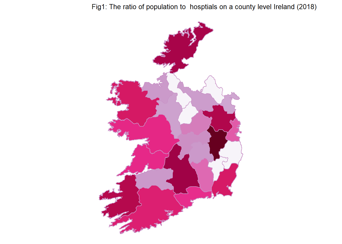
The first plot questions the current accessibility of hospitals in Ireland, by examining the spatial distribution of public hospitals on a county level as a function of county population. The data clearly indicates that the distribution of both hospitals and population are not equal throughout the country. This is common knowledge; as people are moving from rural areas to urban areas in a process called urbanization. (Fig,1) also displays a few problematic areas where the number of people per hospital is large. The counties most affected are Donegal, Tipperary, Kerry and Kildare, Monaghan and Leitrim. As the majority of these counties are within a reasonable distance to medical hubs such as Limerick, Galway, Dublin and Cork there problems are mitigated, however Donegal, Leitrim and Monaghan are somewhat isolated from the rest of the country exacerbating the pressure on other local services.
 |
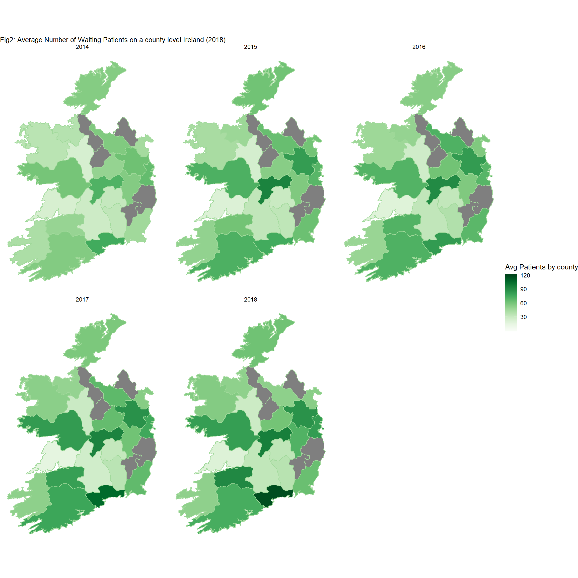
The second figure displays the temporal and spatial aspects of the patient waiting times in Ireland. Similarly the average number of patients waiting at any point in a year was plotted on a county level. From a temporal aspect it is clearly visible that counties such as Cork, Limerick Dublin and Galway are suffering the most from long patient waiting times. This is an over spill highlighted by the previous graph which shows the unequal distribution and degradation of medical resources throughout the country. Forcing patients from neighboring counties to seek medical attention in their institutions.
 |
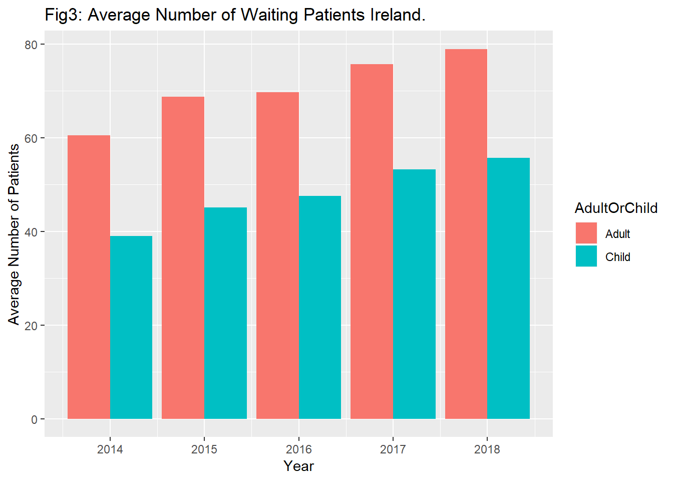
The third graph is a bar chart that shows the temporal trend in the average yearly patient waiting times. Unfortunately this graph demonstrates an upward trend for both adult and child patients. Surprisingly the number of children waiting for attention is almost two thirds of that of the adults despite the most recent statistics from the CSO office stating that the ratio of children under 16 in Ireland is 21% of the total population. This obviously shows that there is a lack of pediatric services available. This is also alarming as the Irish population is trending towards a higher average age as the number of children has actually diminished over the last twenty years.
 |
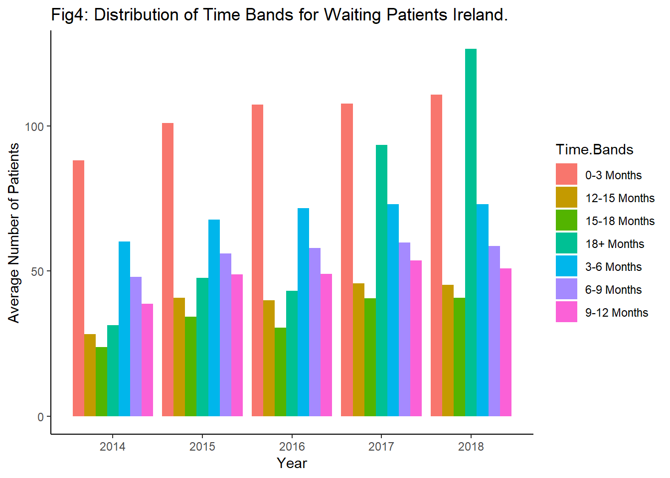
The fourth plot shows the variation in waiting time bands as a function of year. The total waiting time is clearly rising however not every time band is increasing at the same rate. Both the the longest (18+ months) and and shortest (0-3 months) time periods are experiencing the greatest variation in patient numbers. This implies that these are the most common and therefore the most taxing points of care for the health service especially the over 18 months care which has seen the greatest variation a sign of Ireland’s aging population.
 |
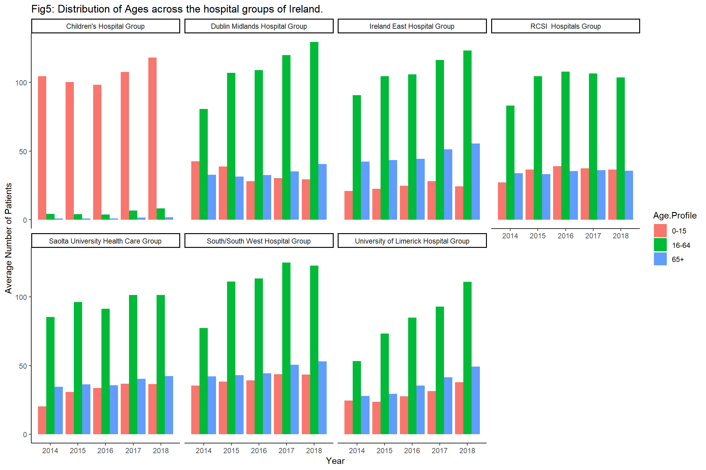
The hospitals in Ireland are organised into seven Hospital Groups allowing the services framework to be more flexible as it is distributed across seven hubs. The fifth plot represents the performance of each hospital group in the temporal domain. The average patient waiting times are split into three categories children, adults and old age pensioners. It is apparent that the waiting times for every Hospital group and category are rising.However the University of Limerick, South West, Dublin Midlands, Ireland east, and children hospital group all seem to be struggling.
 |
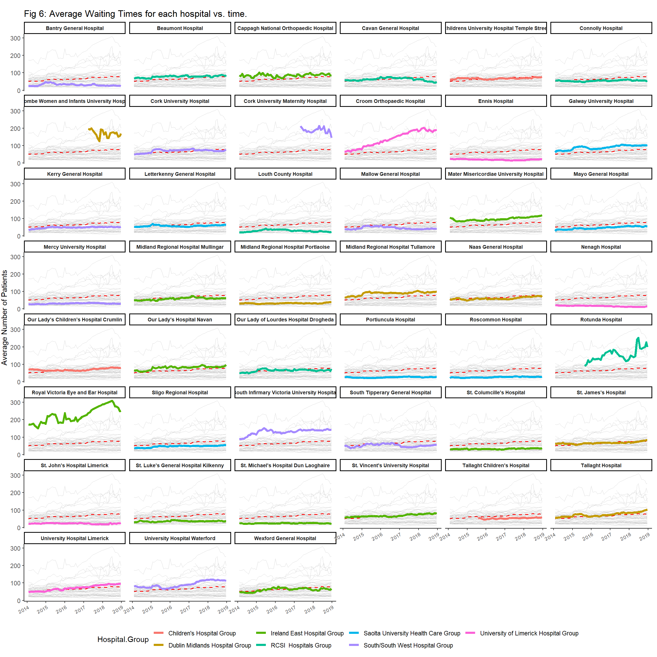
The sixth plot is a time series plot of the average number of patients as a function of time. Each hospital is highlighted and faceted to its own graph with a red dotted line signifying the average trend of all 43 hospitals in the data sets. The colour of each hospital line also refers to the group which that hospital belongs to. The majority of the rural hospitals waiting times have slightly increased over the years. Whilst the hospitals that have seen the greatest increase in hospitals waiting times are Cork University Maternity Hospital, Coombe Women & Infants Hospital, Croom Orthopedic Hospital, Rotunda Hospital, Royal Victoria Eye and Ear Hospital and the South infirmary hospital. There does not appear to be any trend in the hospital groups performance which echoes the previous graph. However 4 out of the worst effect hospitals with women and children.
 |
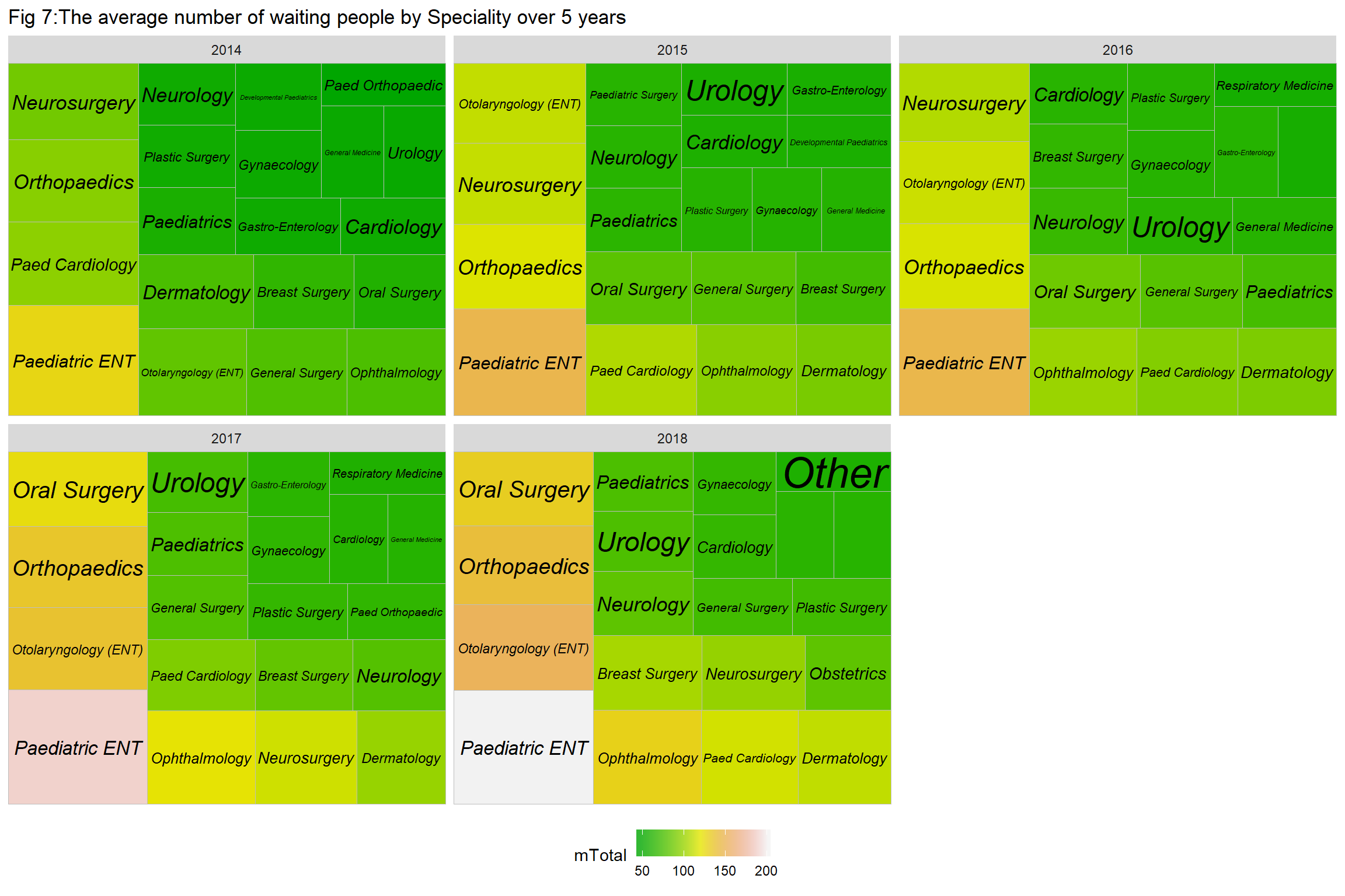
The final graph is a treemap; the area and color gradient of a specific cell displays the average number of patients waiting to receive specialty care. It is unequivocal that Pediatric ENT has the worst waiting times of any specialty, Neurology, General ENT, Pediatrics, Orthopedics and ophthalmology are also notably high.
 |
Conclusion
It is evident that Ireland has a particular problem with waiting lists. The average number of patients waiting to receive specialty care is increasing year on year. The most shocking discovery made was that children are facing disproportionate waiting times when compared to any other age bracket. The healthcare system has been badly hurt from the cutbacks of the 1980s, 1990s and 2009-14 and has never fully recovered. There are fewer hospital beds than in 1980, whilst the population has increased by a third and the older population by twice that. Undoubtedly the framework and direction of the HSE needs to change. Politicians and academics are divided on how to proceed. With arguments made to move in direction for an NHS style service, while others look for lessons in Berlin and Havana. Whatever the solution it needs to be addressed immediately as this problem will not be going away anytime soon!.
